This version is most commonly used. It is made for bright Backgrounds.
The negative versions is often used. It is made for dark Backgrounds.
The full white version is only used when a logo is needed on a red background that has the same shades of red as the standard A and therefore affects the legibility.
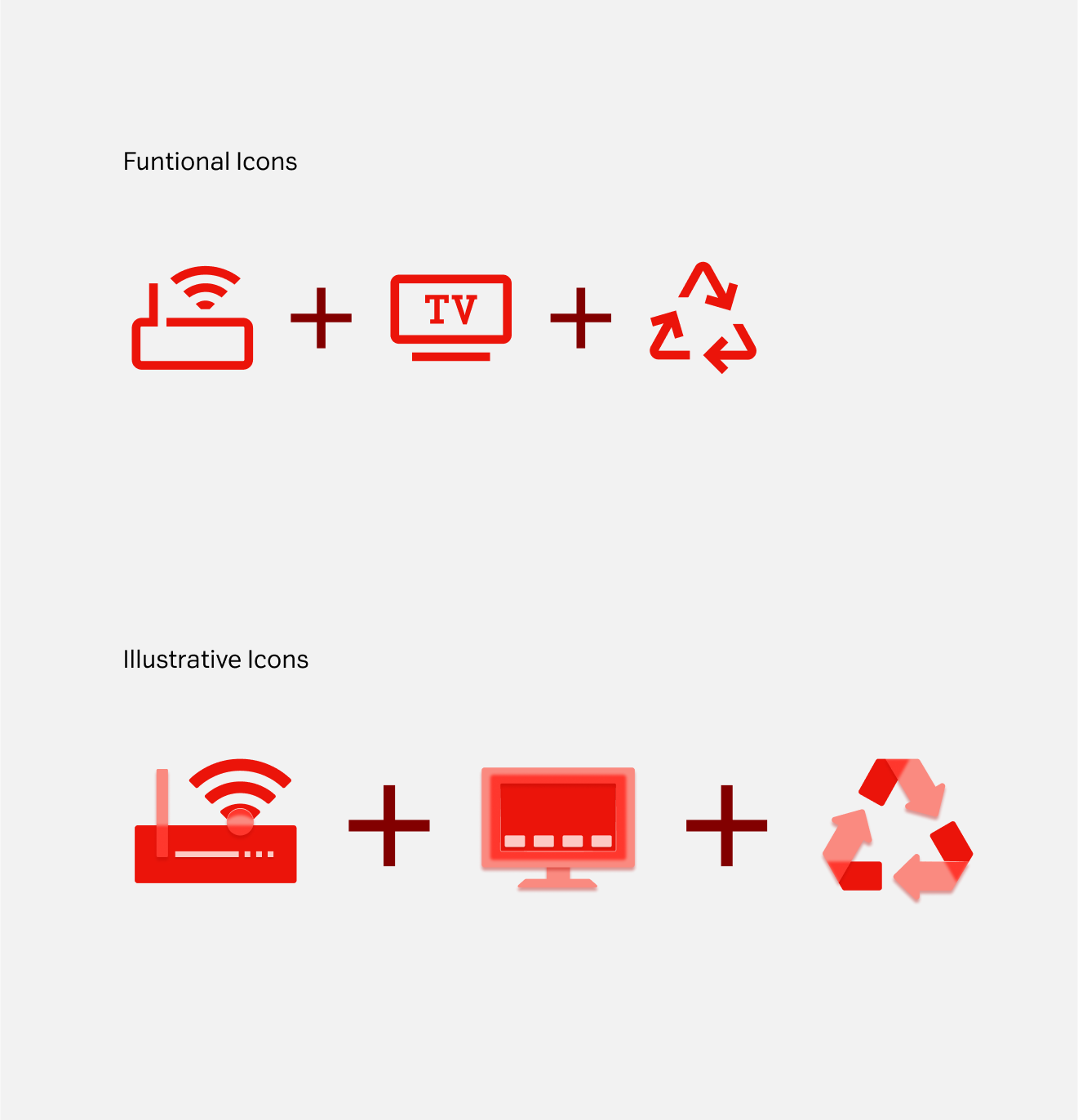
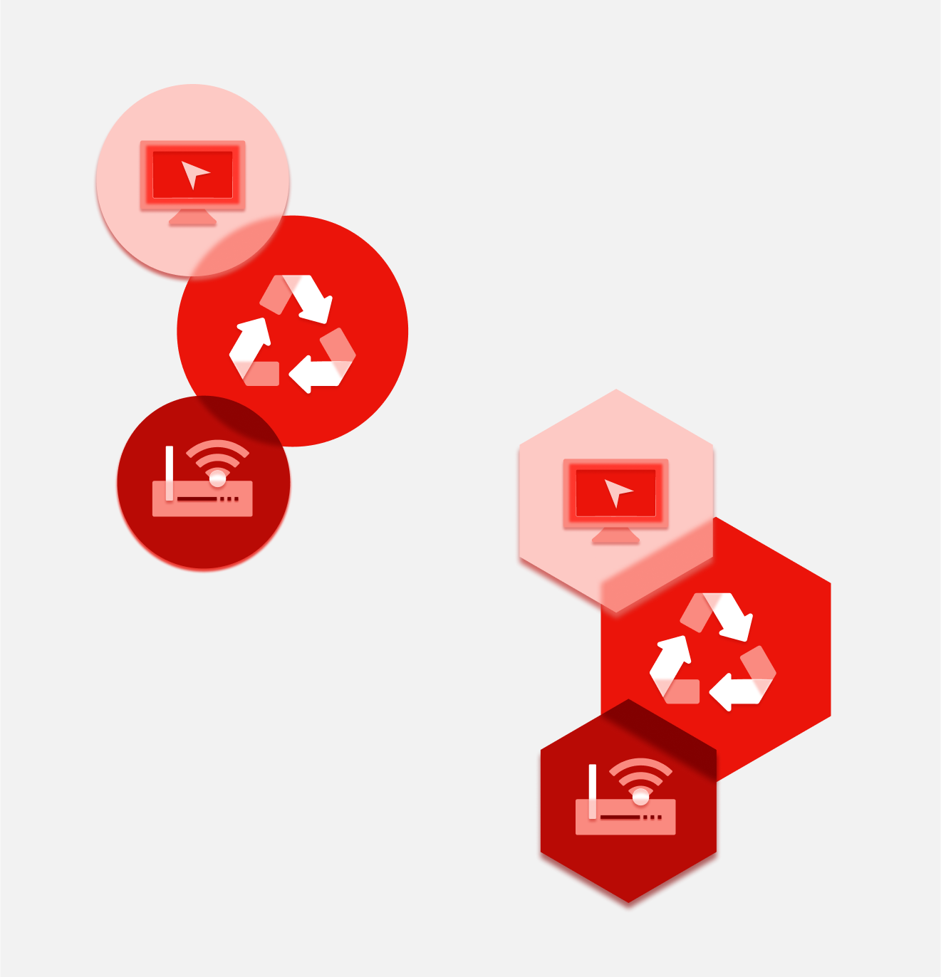
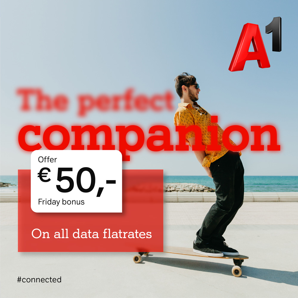
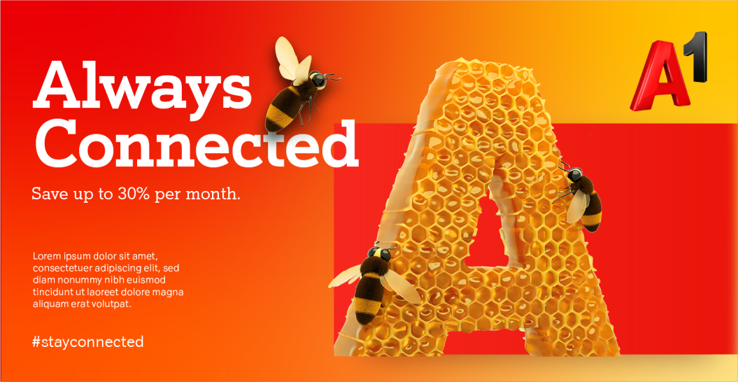
Logo landscapes give us the ability to build different brand worlds both in print and digital applications. Landscapes can be created based on the Red A as a key visual but also from the themed As to complement related messages.
The primary palette consists of red and grey tones, it is derived directly from the colours found within the standard positive red logo from the highlights to the shadows.
The accent colour palette consists of a set of oranges and blues, both chosen to accent the primary palette, it allows for versatility when applying colour.
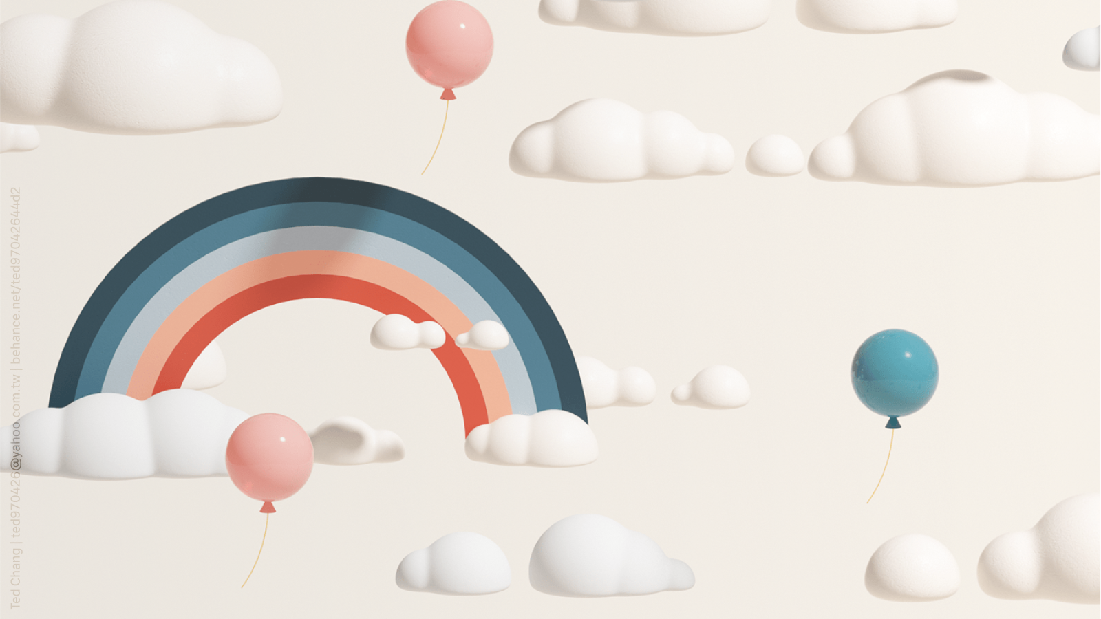
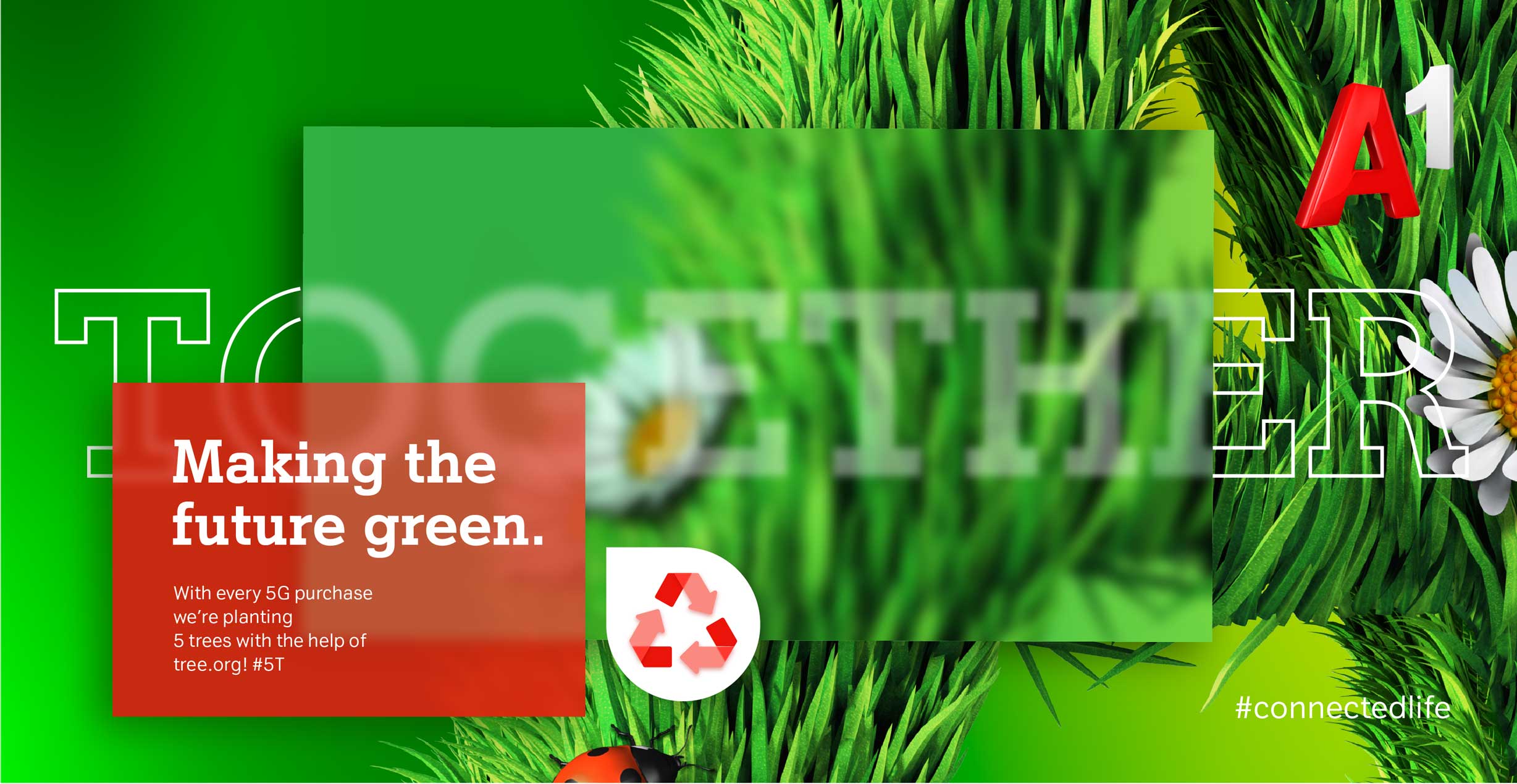
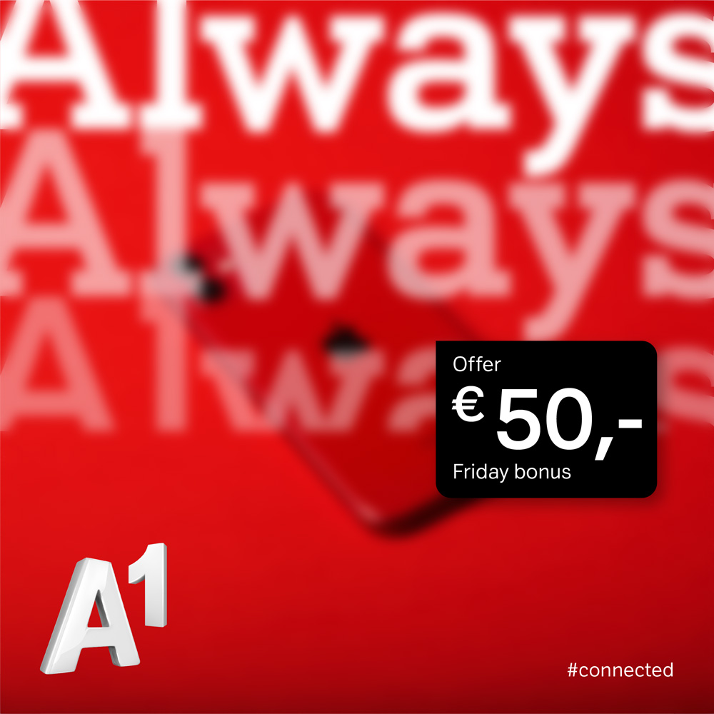
Colour gradients create depth and movement throughout the brand language.
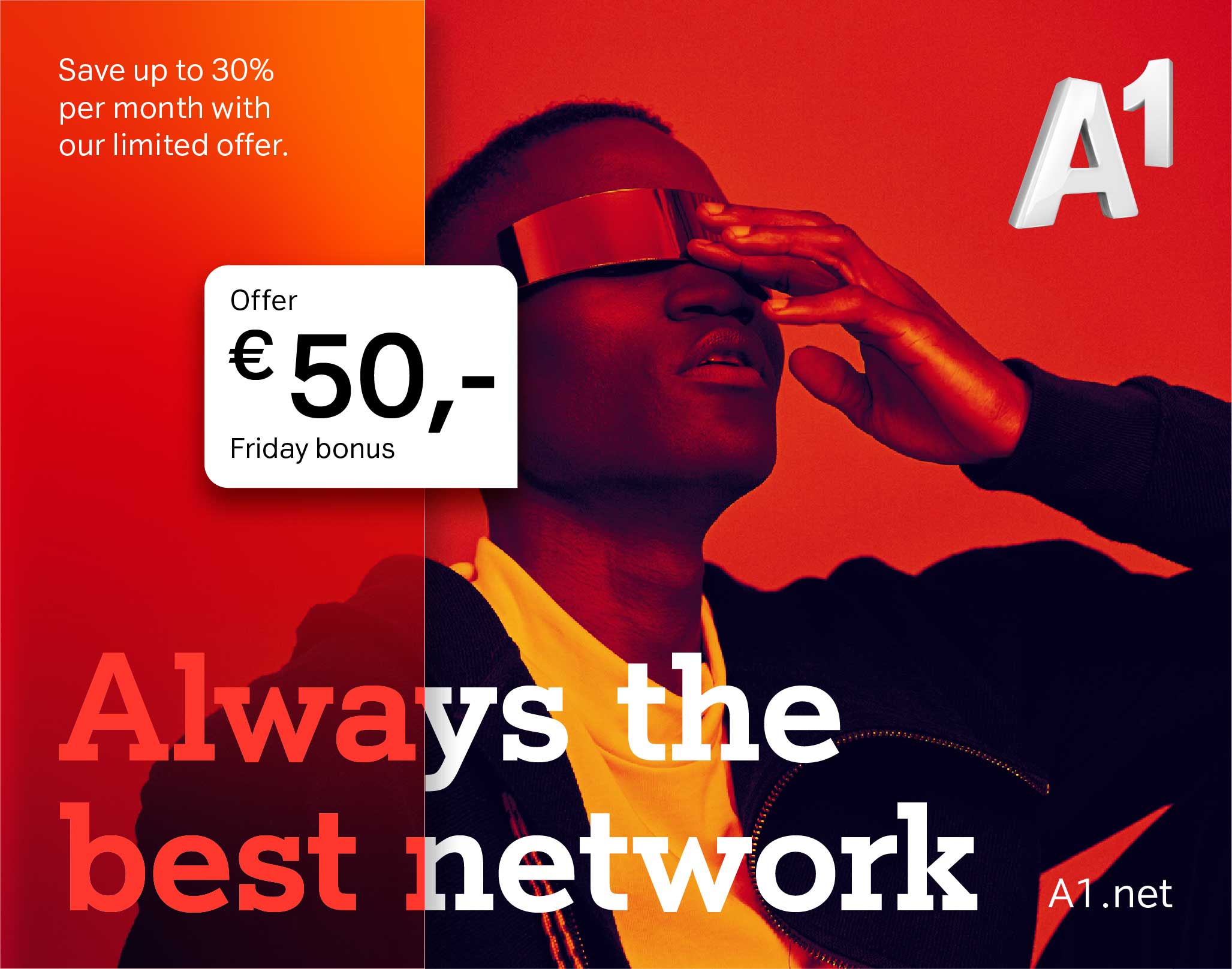
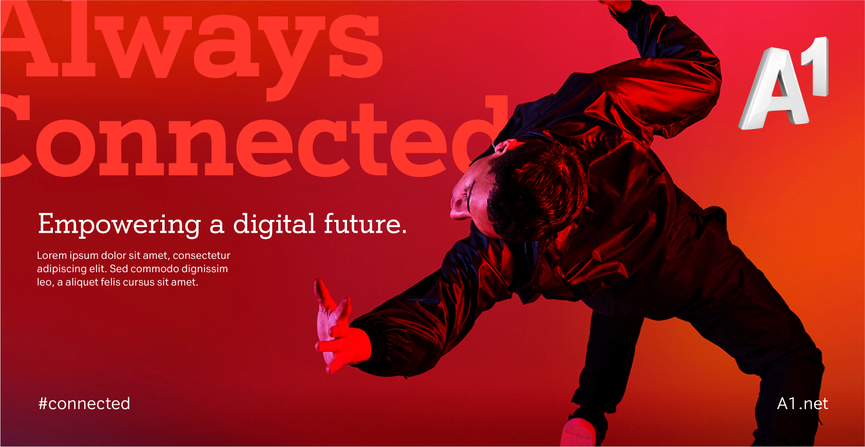
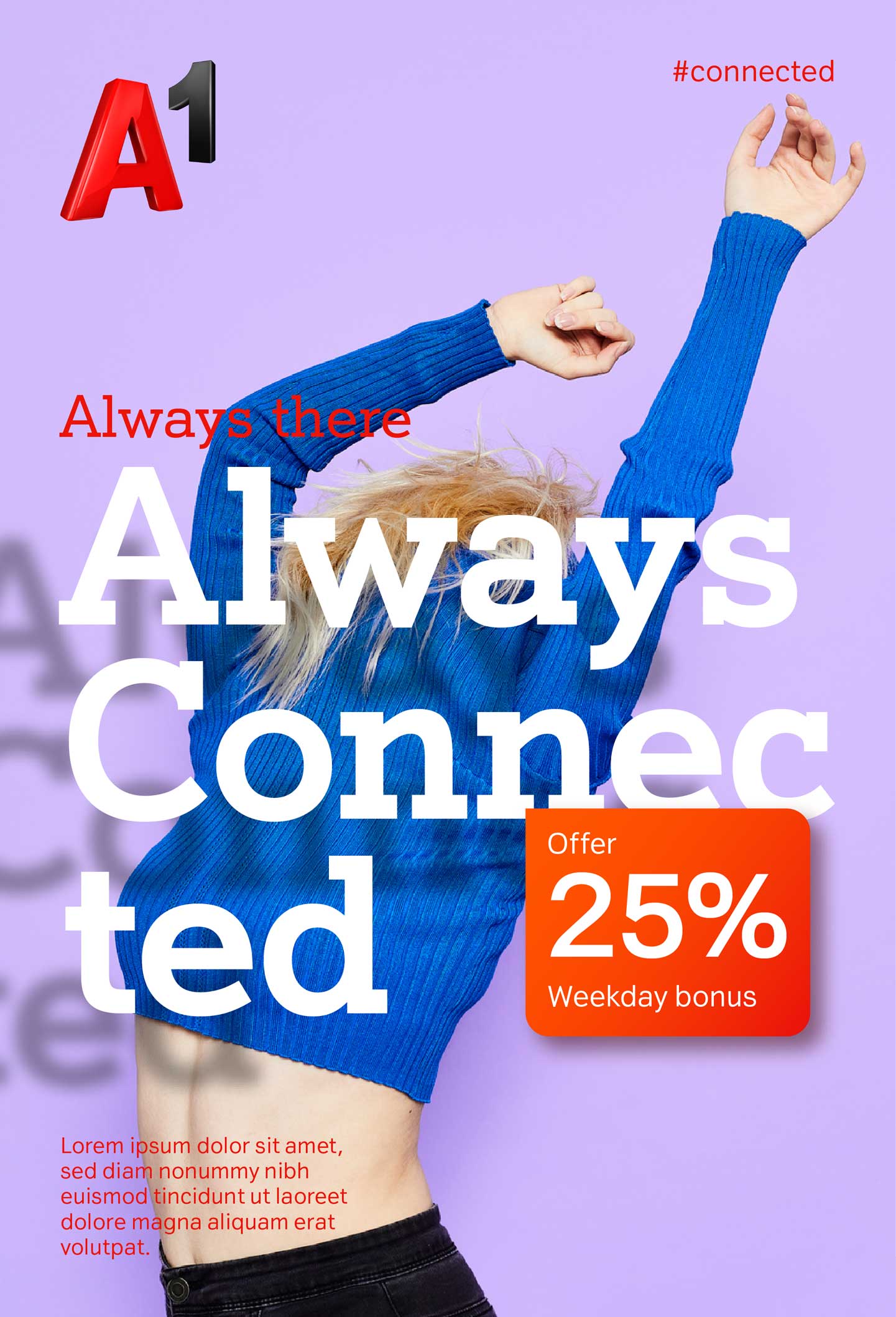
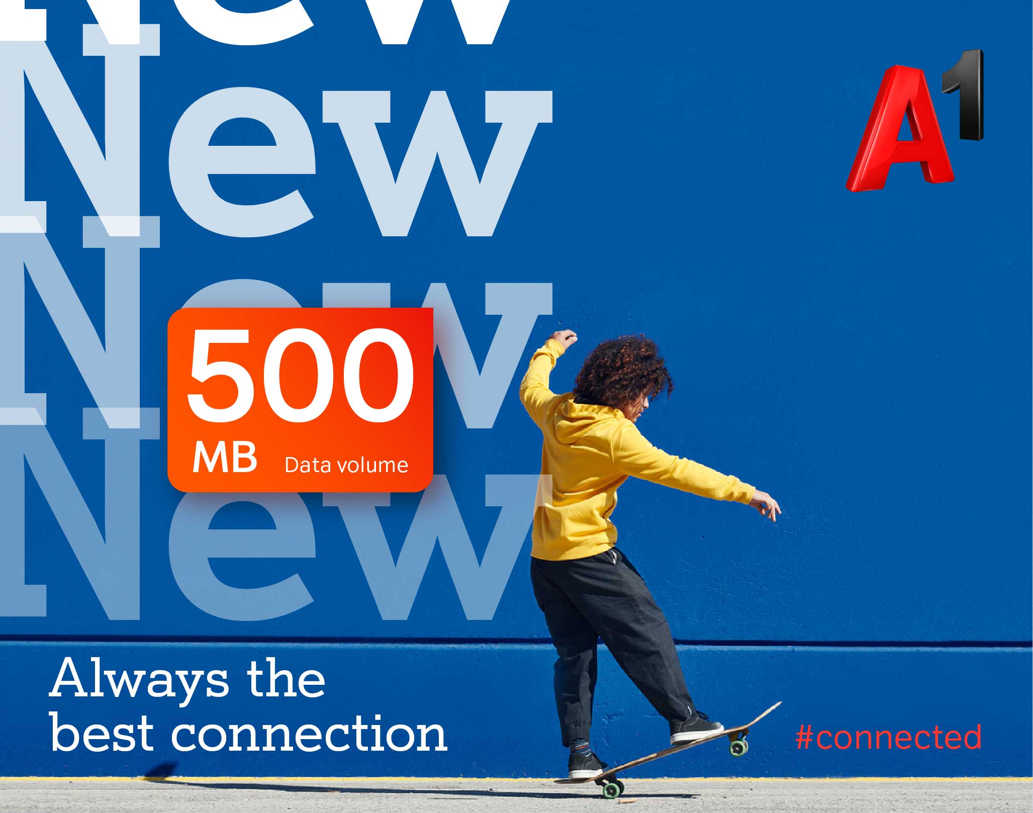
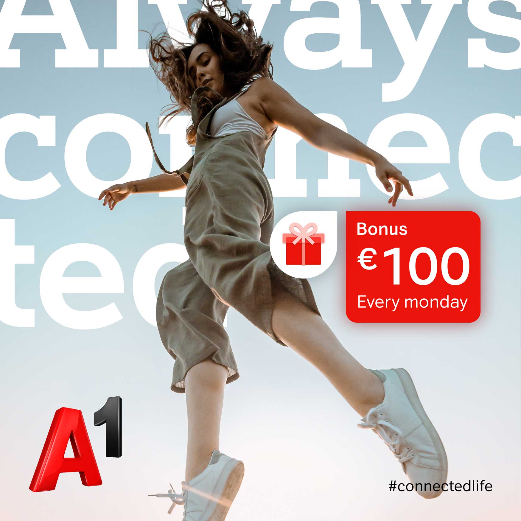
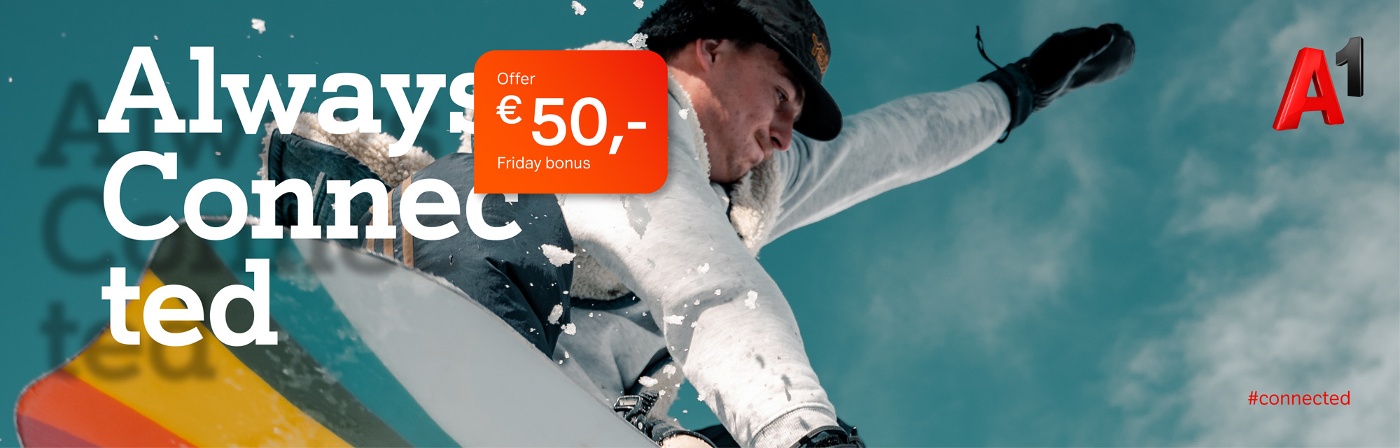
Our lifestyle photography tells stories, depicting emotions and experience our customers can connect with.
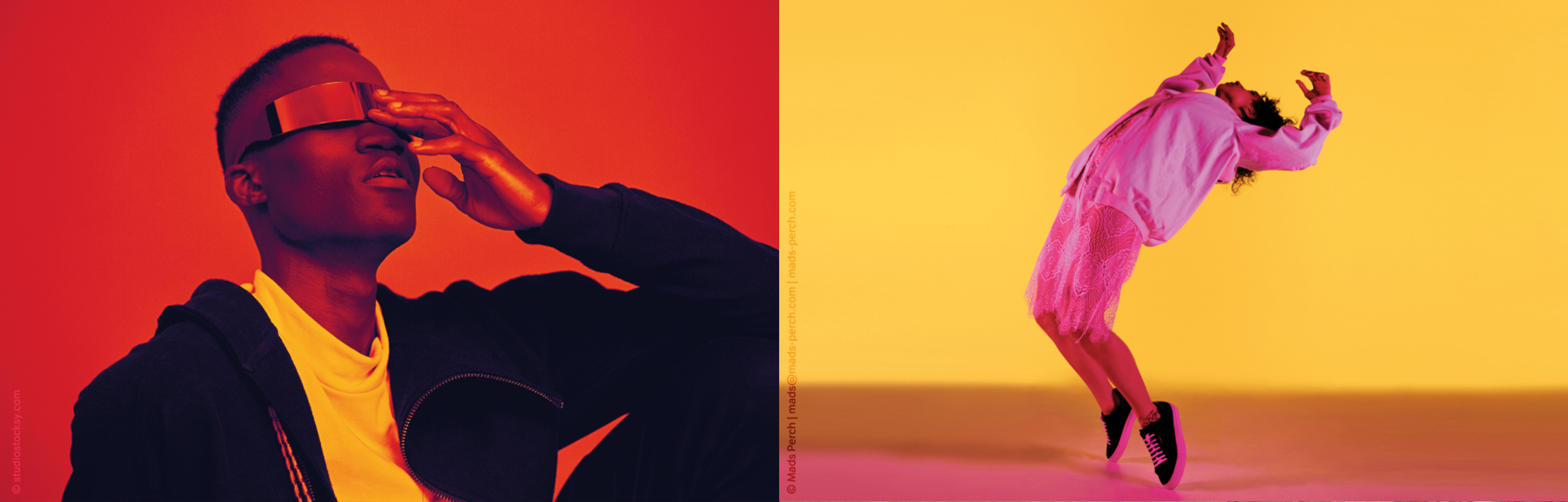
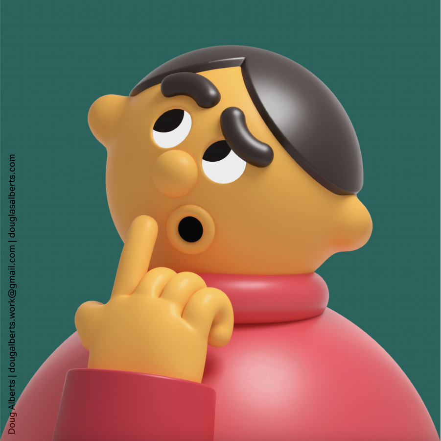
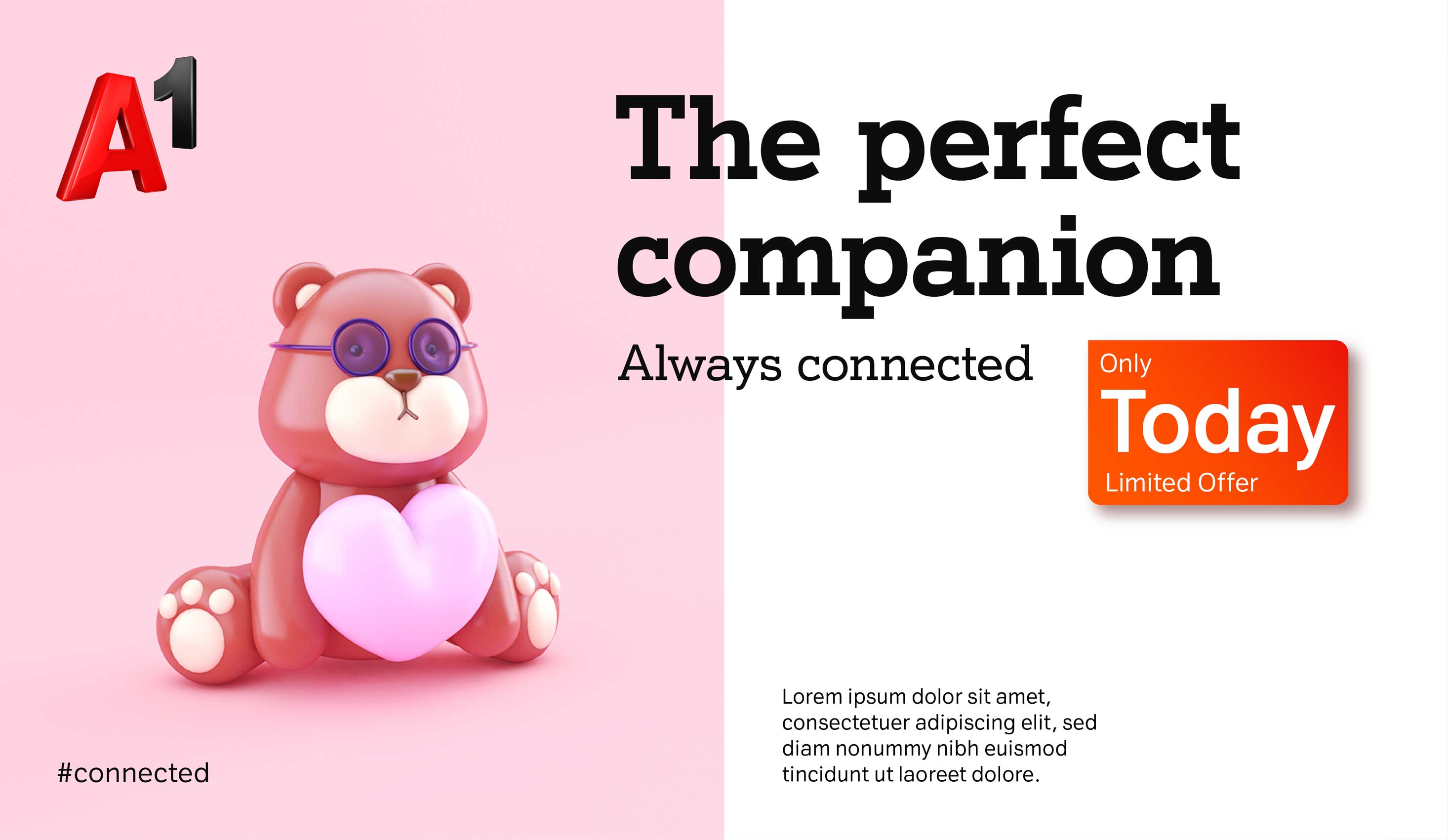
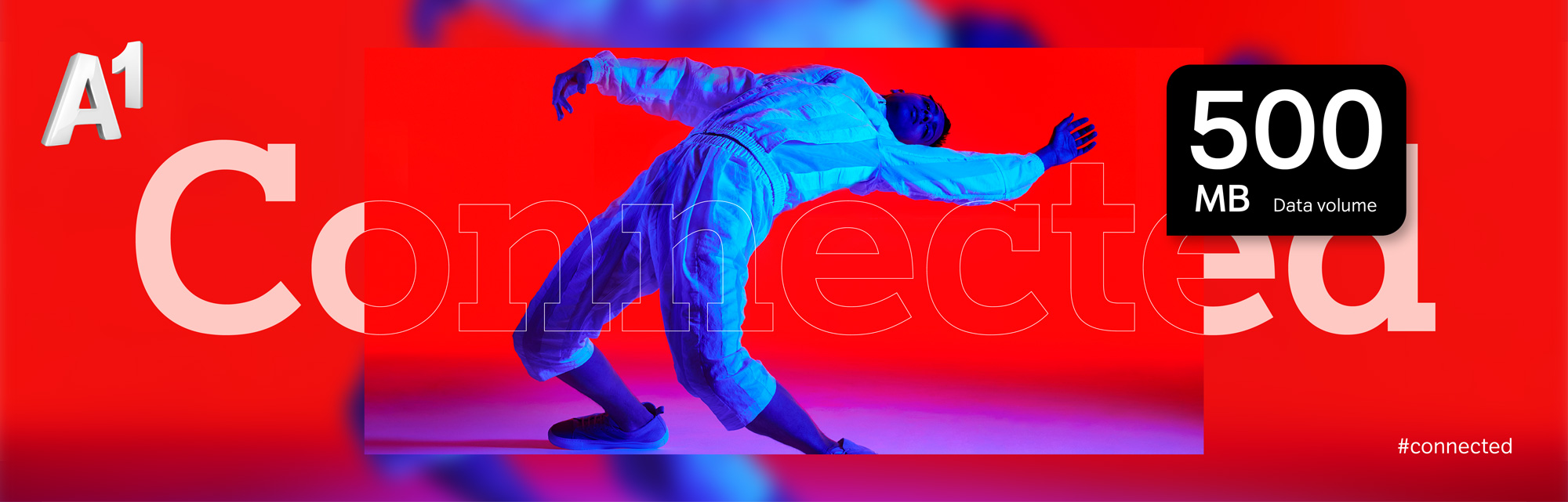
Our studio photography focuses on people. The images should show dimension, with strong colours, high saturation and contrast.
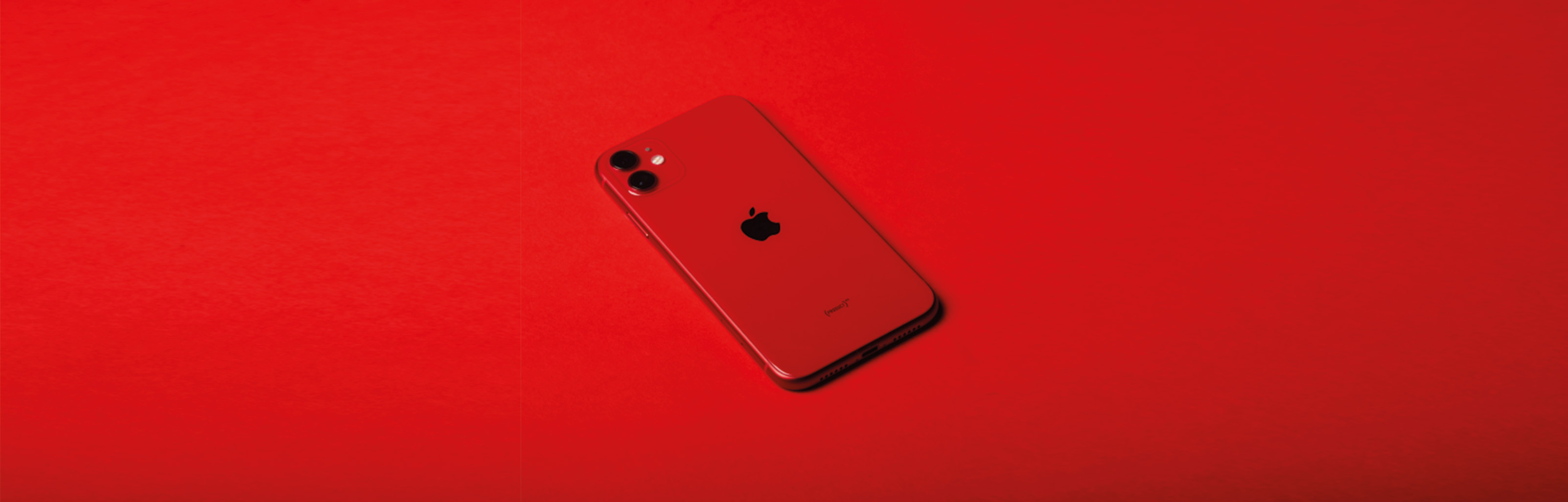
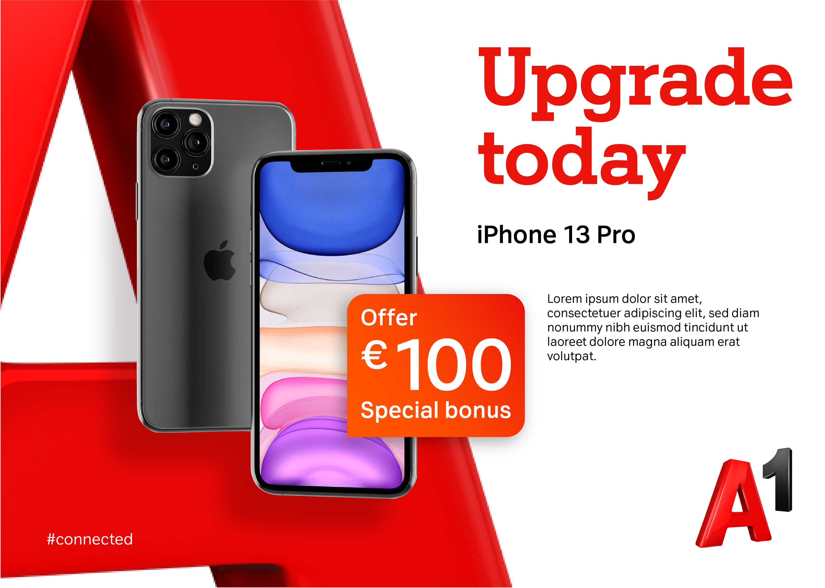
Product Photography is staged in a studio situation with strong contrast to make the product stand out.
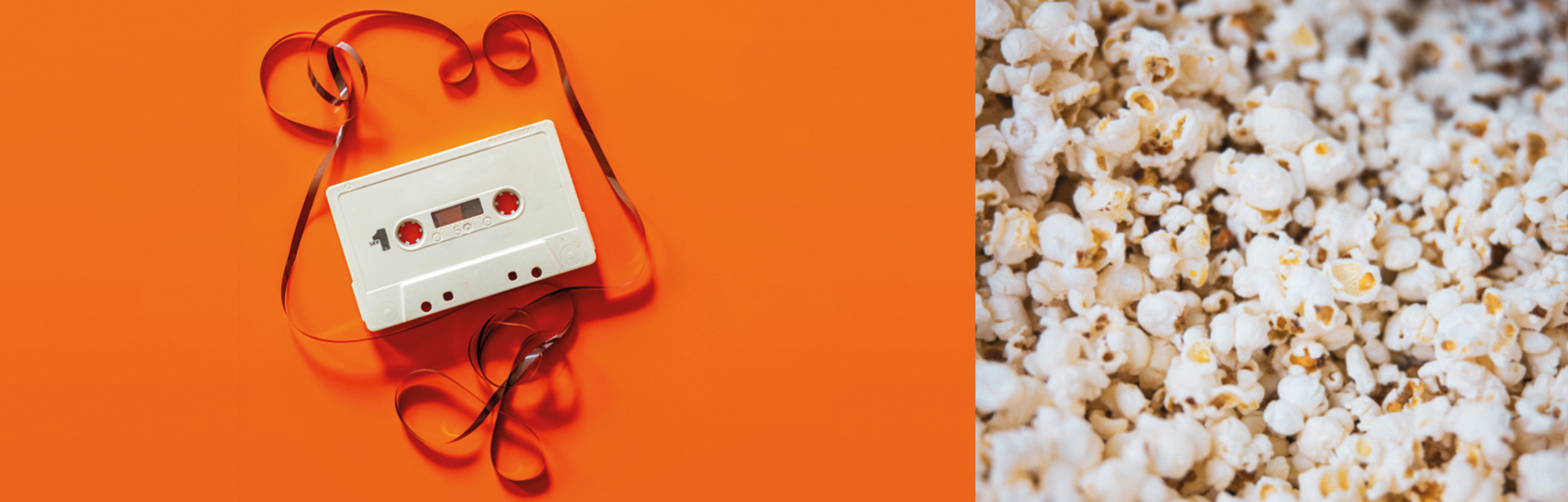
Background Photography are to be used exclusively for our logo landscapes. Panoramic images as well as detail shot are part of the background photography.
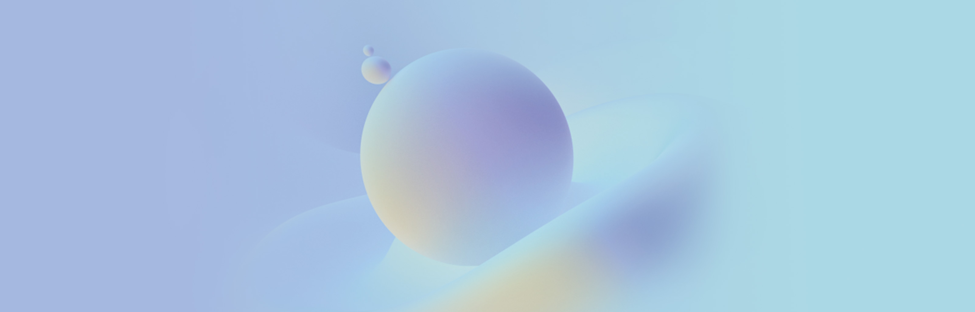
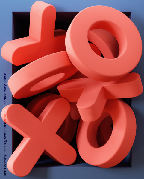
Texture Images include soft, round and fluid textures, which are depicted in a wide range of colours.